Unilever wanted to refresh their identity, and build their brand into one that consumers actively choose (rather than passively consume). In 2018, we embarked on a project to do just that.
Right from the start, we spoke about not changing their logo. Not only would it cost too much to change (there are thousands and thousands of product SKUs with it on globally), but as marks go, it’s actually great. It has all the richness and complexity and intricacy that the brand needed to convey. The issue was the design system that surrounded it.
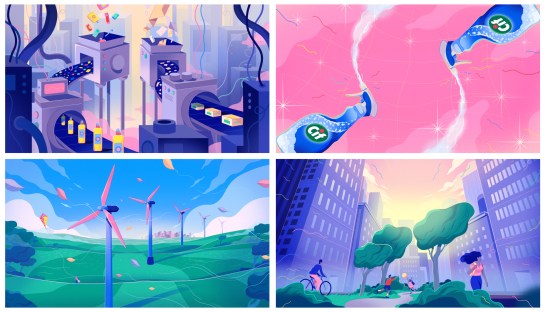
The new identity needed to shift us away from our competitive set (many of which have been known for greenwashing) and instead create a new visual language for sustainability, that celebrated the many small actions that people around the world are taking every day. We developed a number of design principles, that could help us make decisions on visual design, tone of voice and behaviours.
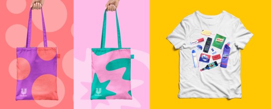
After that, we looked at palette. We refreshed the Unilever blue – to be more vibrant and bright.

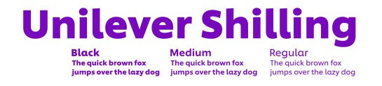
And we created a custom palette to complement it, that was fresh and easy to use. We commissioned a new typeface. We named it after Lord Lever’s first grocery paycheck ‘a shilling a week all found’, to act as a reminder that amazing things can start from humble beginnings.
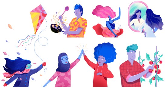
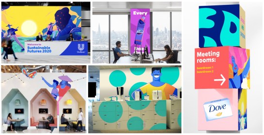
We employed an illustrator to develop custom graphics and illustrations that could be used across the new brand world.
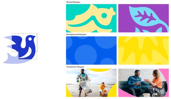
And we developed a shape system, that took the icons that make up the Unilever logo, and crates beautiful crops of them, to create a consistent and dynamic pattern across all our assets.
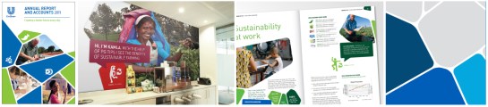
Here’s how it all comes together.
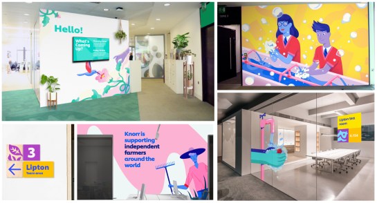
We’ve had great feedback from employees around the world, and the identity is currently being rolled out across the organization.
