Central St Martins – Degree shows @ Kings Cross Campus 28.06.15
On Sunday Wist and I popped along to the CSM degree shows in the new KX campus. The sheer number of pieces on show was frightening – it’s scary to think about the number of people trying to break into the creative industries in a given year.
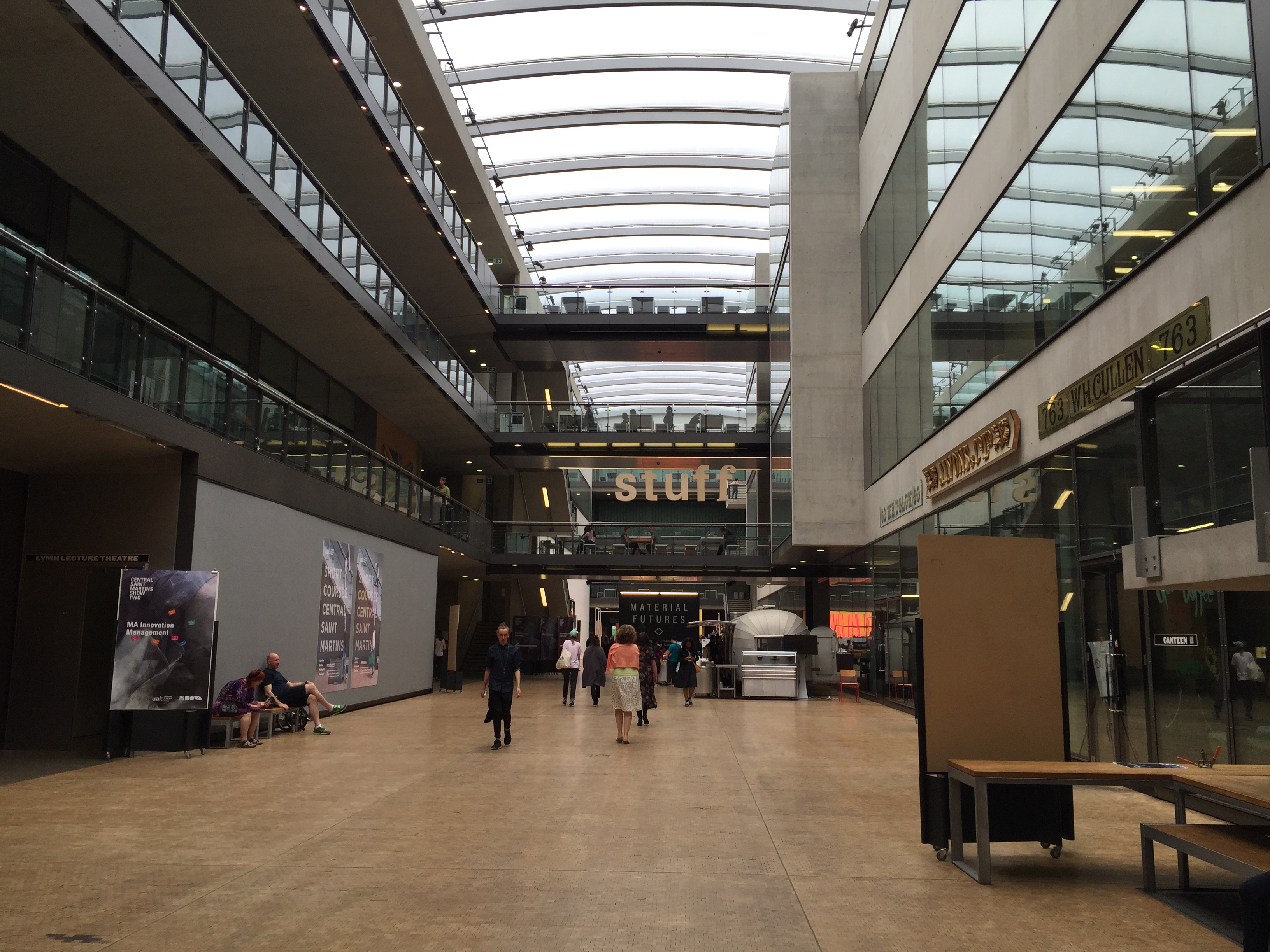
The space itself is fantastic – so much so I think it needs its own post. They’ve clearly thought strategically about how to create an environment that stimulates creativity. They’ve definitely read d.school’s ‘Make Space’.
The calibre of work exhibited was exceptionally high.
But what struck me most was just how polished their presentation skills are. They’ll have no trouble sidestepping the commercial world of powerpoint and pdfs.
I particularly like that each project has a process book to map the journey of creation. That’s something we should all do more often.

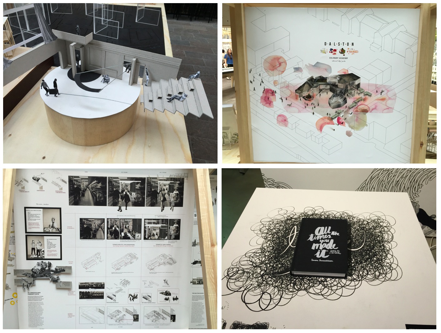
Here are some of my favourites projects from the day:
In the narrative environments show, the two pieces that jumped out to me were both dining experiences. The first, by Heng Yi Lin, was a silent dining experience that utilized objects on the table to prompt different tasks between a couple – all designed to help the pair better express their emotions without verbal communication.

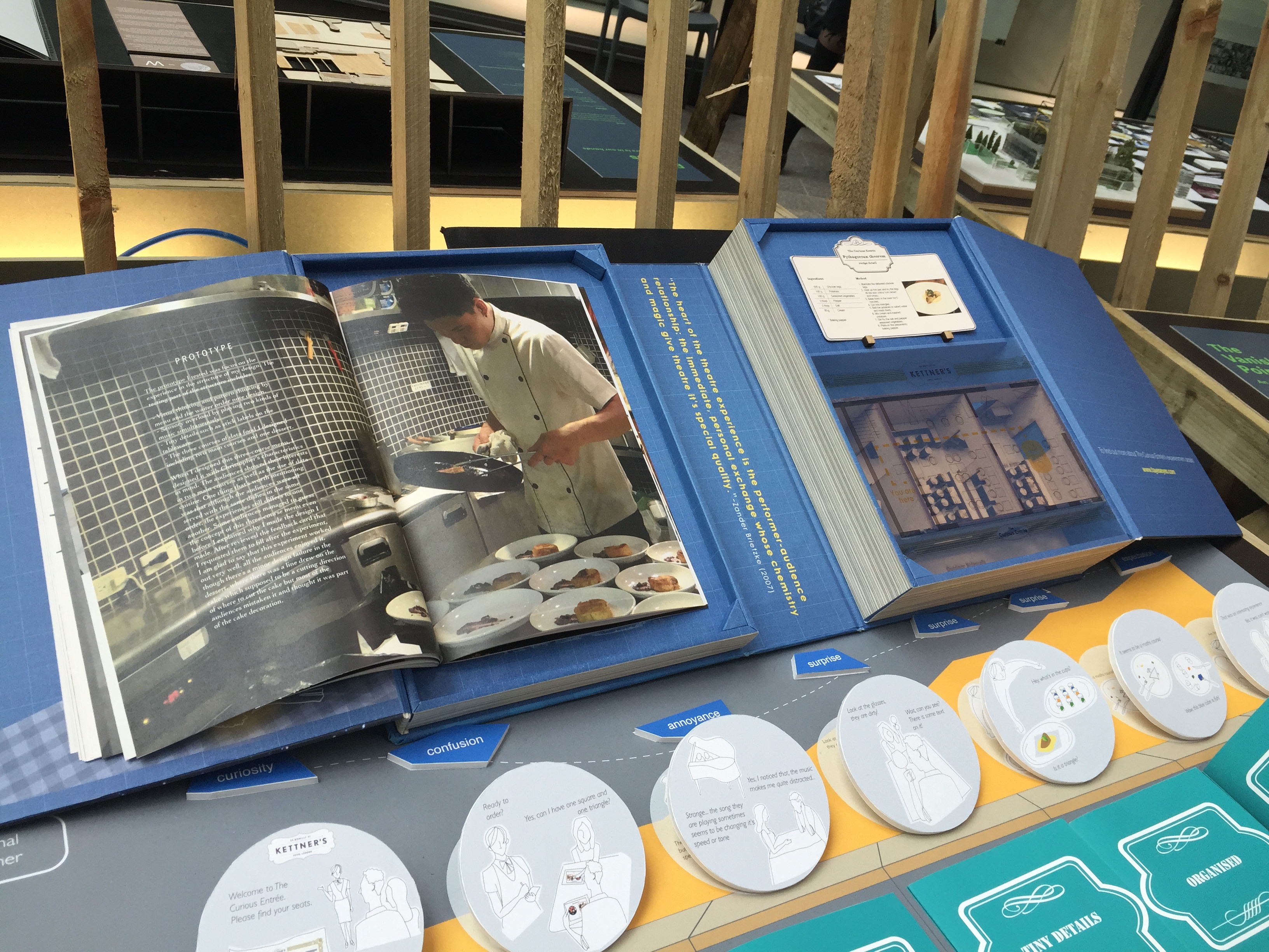
The other, called ‘The Curious Entrée’ (by Ching-Fang Chien), invited guests to experience a pre-theatre narrative dining experience that helped the audience gain a better understanding of the play they were about to see. This extension of one experience into another is really interesting – and I’m sure we’ll see a lot more of it in the future. Cinema-restaurants (with food inspired by the film) will be the next big thing in London, mark my words.
The Communications Arts degree section was packed, and fairly disappointing. Two projects jumped out at me.
The first, Emil Kozole’s ‘Project Seen’, introduced a typeface designed to prompt us to reevaluate just how often NSA and GCHQ intercept and filter our communications. Every time a trigger word is written (e.g secret, or punk) the typeface crosses the word out.

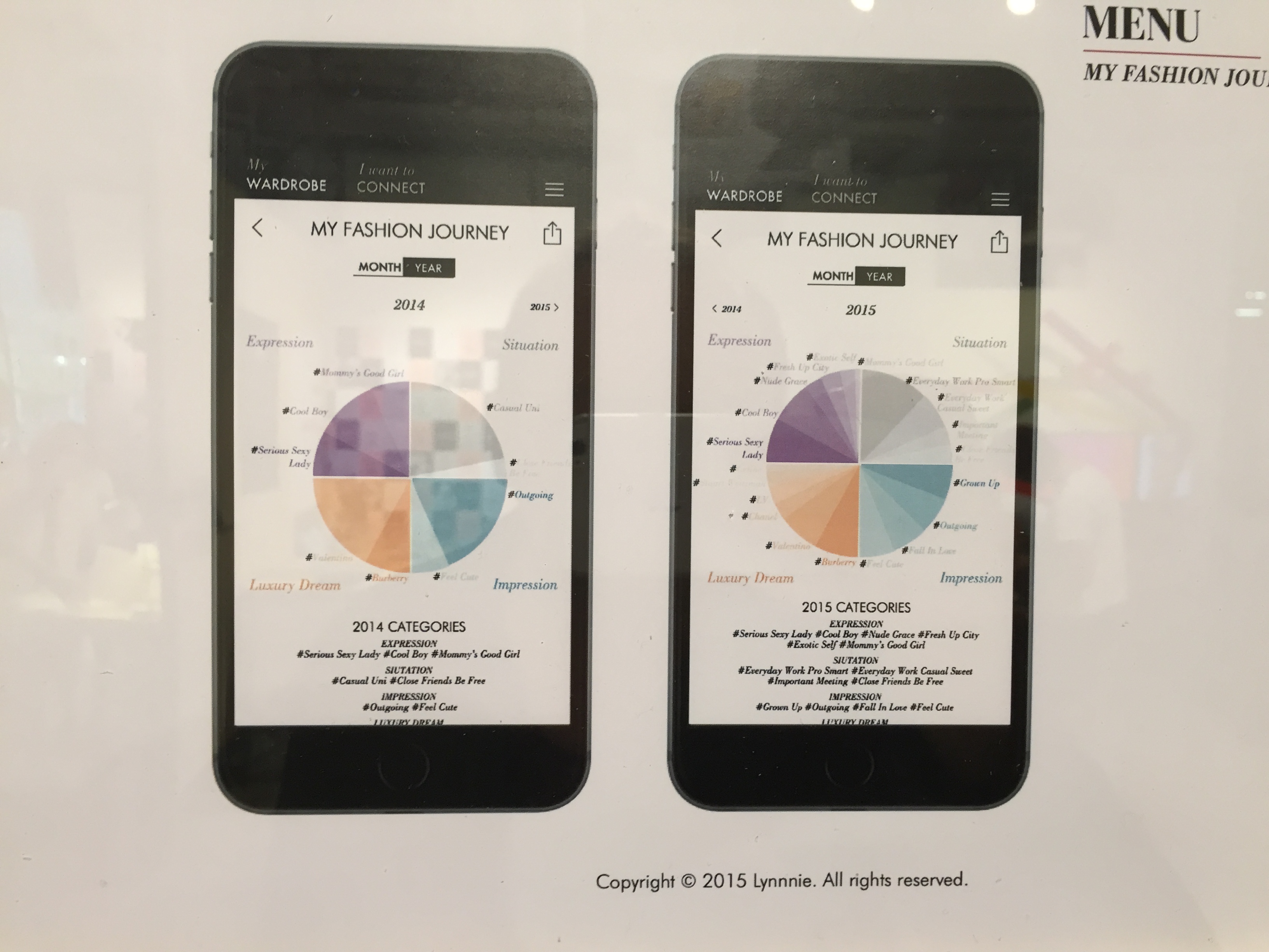
The other was a project by Lynn Nie, called ‘My Fashion Style’ that aggregates and analyses a person’s wardrobe, and helps them make sensible and informed decisions when shopping. It got me thinking about the role of personal data aggregation (with apps like Delicious Library) and how we’re only scratching the surface of our own unique data.
In the graphic design show, I loved Violette Chatiliez’ walking tour guides, written from the perspective of different authors. In her own words, her aim is to ‘encourage people to interact with their urban environment differently by suggesting alternative ways to move through the streets.’

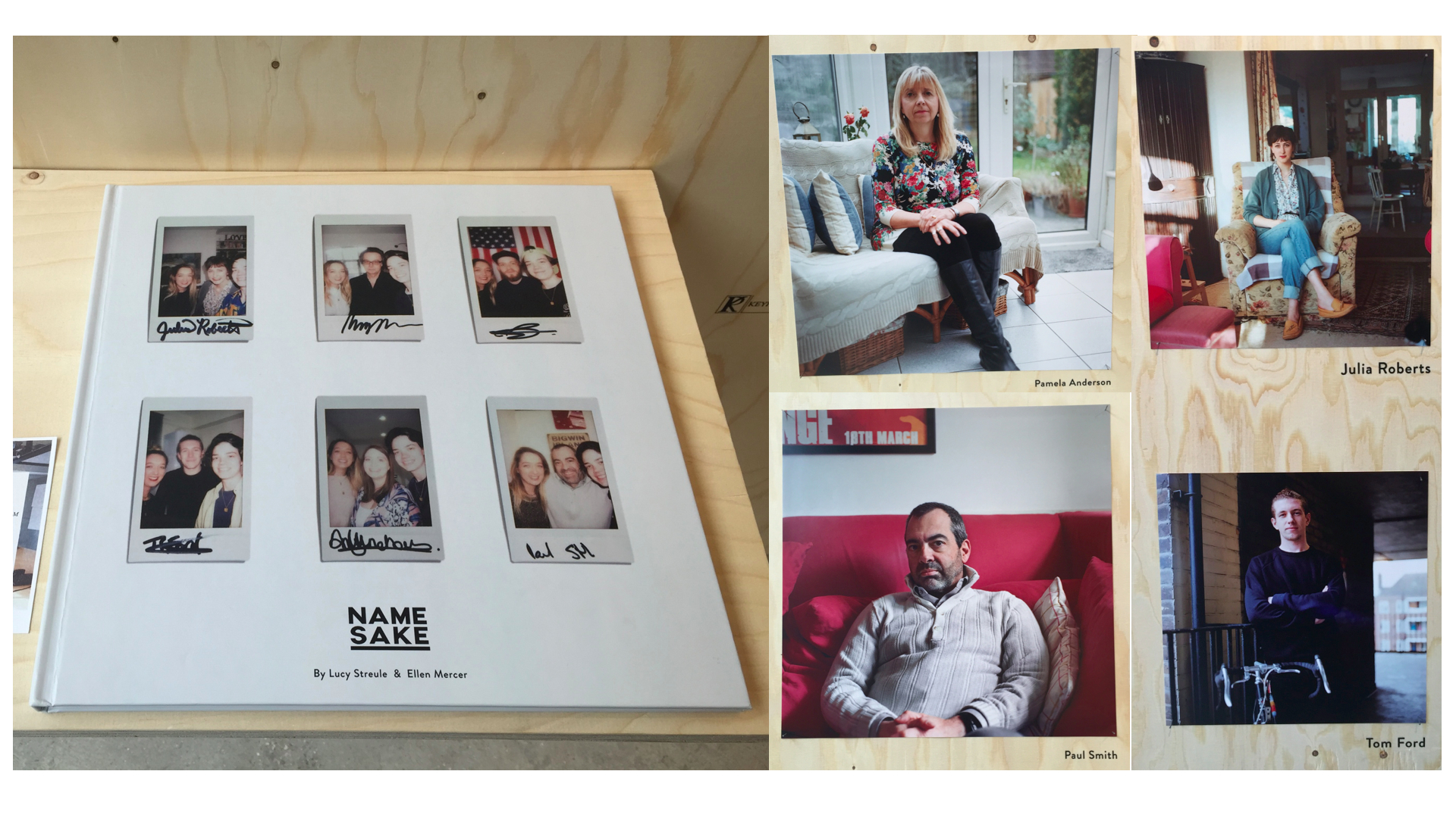
Lucy Streule and Ellen Mercer’s NAMESAKE book struck me as a great idea – photographing people who share their names with celebrities.
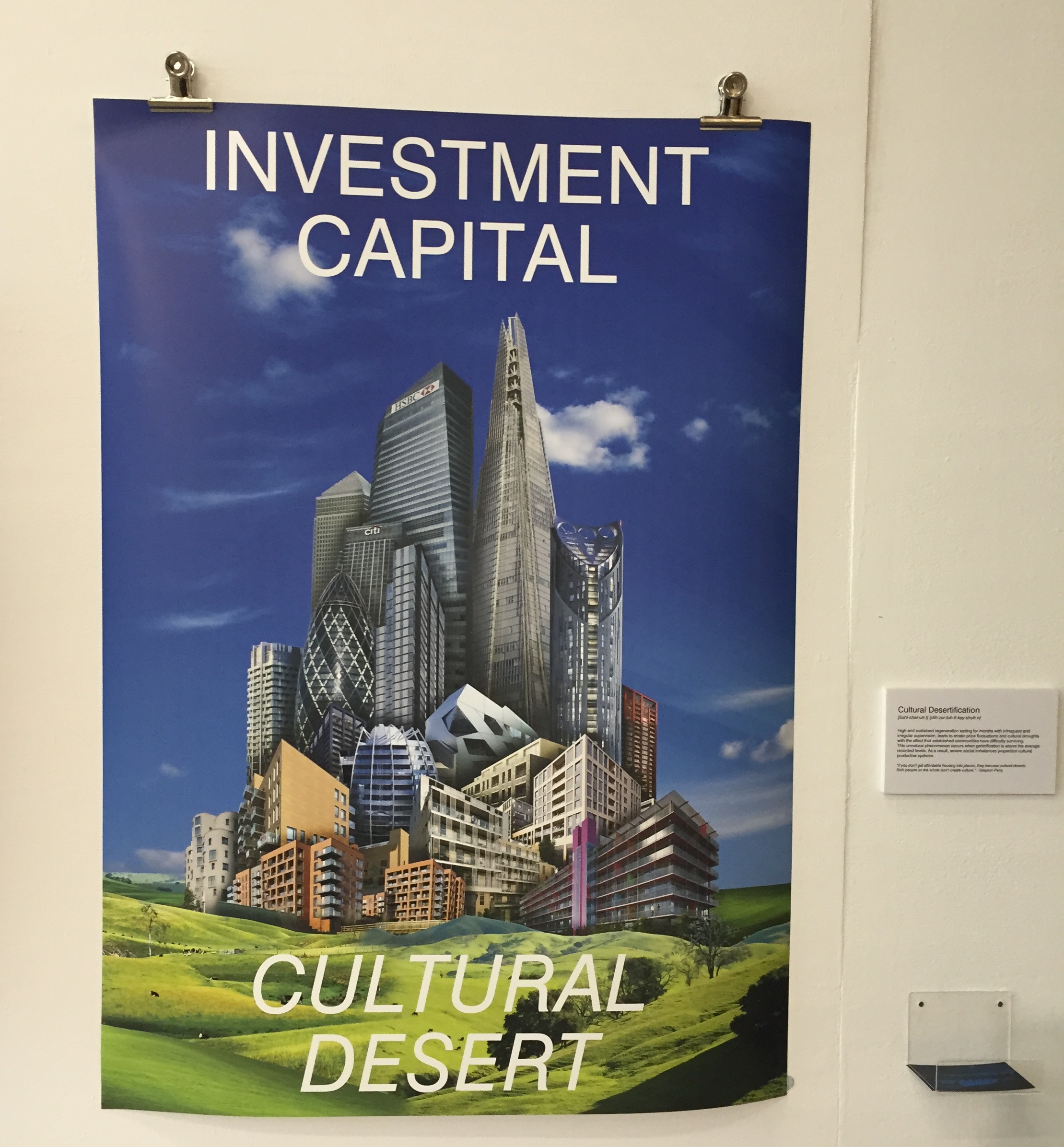
This piece is called ‘Cultural Desertification’. That particular set of words will shortly be coming to a presentation near you…
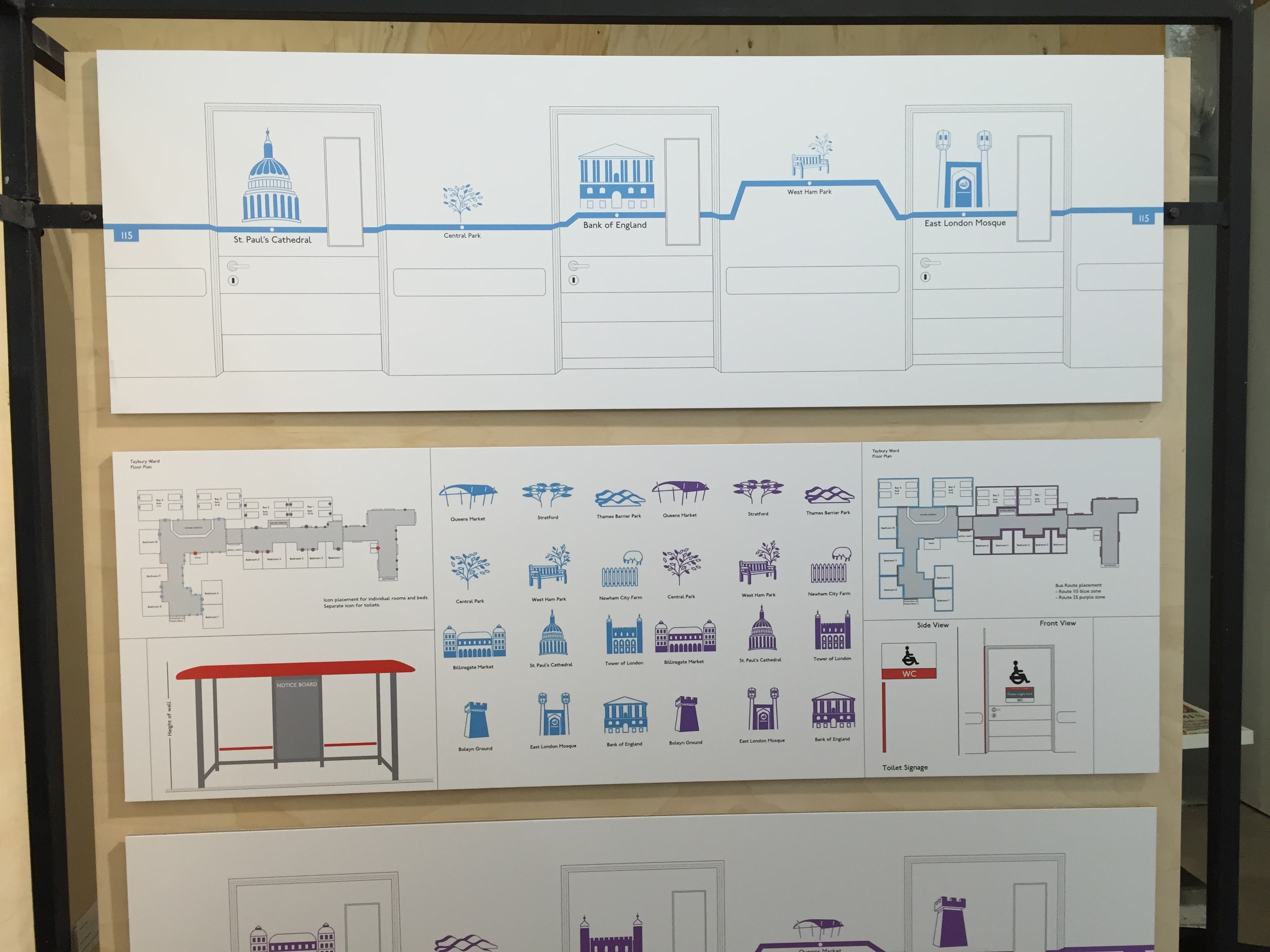
This idea by Jessica Hook is probably my favourite of the day. It’s simple, it’s timeless and best of all, it’s actually going live in the dementia ward at Newham hospital. The design builds on actual bus routes from Newham to London, mapping the sites across the ward. It encourages patients to follow the routes, remember familiar conversations and spark conversation. Genuinely inspired.
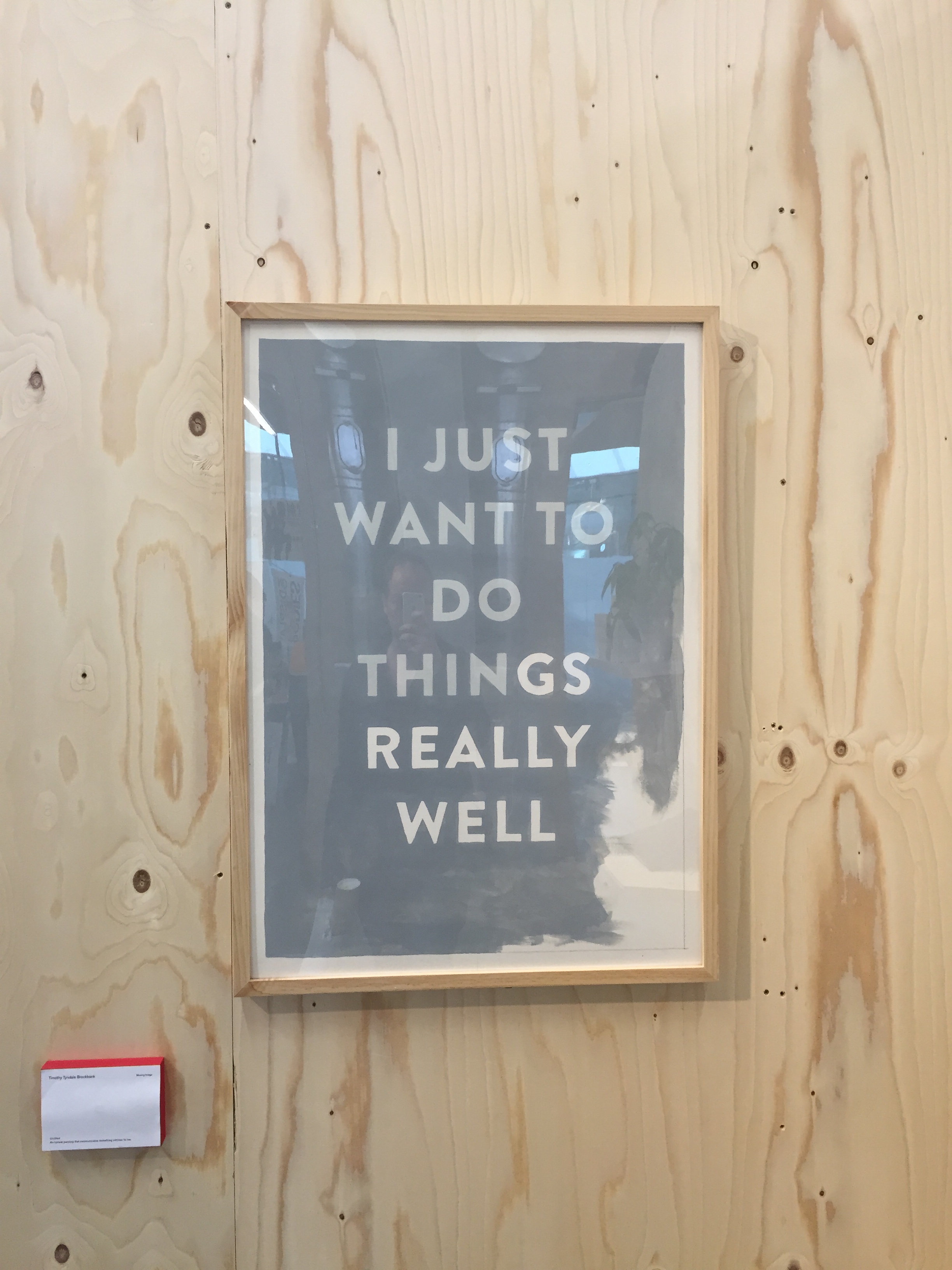
Finally, this untitled painting from Timothy Tyndale Brockbank was created to communicate something honest and intrinsic within the artist. I like it. And judging by twitter, so do a lot of other people too.