Coffee Shop: Dose, Smithfield
Time: Tuesday afternoon
Coffee beans: Square Mile + Guest Mugaya
Ordered: 1 x Double espresso

Black, red and white fit out. No working space. Two tables and a side bench. Diverse clientele. Very reasonable breakfast menu. Talented but glum baristas. Top notch espresso. Man on bench next to me frustratedly fiddling with Apple watch. Pitstop bench outside very busy.

IMG_4694Coffee.001 Coffee.002

Coffee Shop: Workshop Coffee Co., Clerkenwell EC1
Time: Monday mid morning
Coffee beans: Cult of Done V24 (Roasted own)
Ordered: 1 x Espresso

Attractive interior. Open brick walls. Central serving bar. Vertical garden. Probat roaster at rear, fully staffed and working. Noisy slurps from the head taster’s table. No wifi. Friendly, speedy service. Coffee tastes great. Couple next to me excited about the flower pattern in their lattes.

IMG_4526Workshop.001Workshop.002

Coffee Shop: Appestat, Islington N1
Time: Sunday afternoon
Coffee beans: Climpson & Sons
Ordered: 1 x Black Americano, 1 x Cortado

Beautiful shop front. Inside, uncluttered but chaotic. Tempting breads. Fresh vegetables. Few cakes. Somewhat confused about its offer: Café? Restaurant? Grocer? Village store? Service remarkably slow. Coffee tasty.

IMG_4478Coffee shop #1.001 Coffee shop #1.002

So I’m a bit late putting these up… but I’ve finally decided on what challenges I’m going to do in my 26th year. Should be an interesting (if slightly weird) year…

1. 26 MINI PILGRIMAGES This year I’m aiming to make 26 mini pilgrimages to graves and memorials of people that have influenced the way I think. All have contributed significantly to culture, creativity, art and science. (I’ve got a slightly longer list than the one below, and will swap in and out if the opportunity arises.)

  1. Arthur Conan Doyle
  2. Edward Ardizzone
  3. Isaac Newton
  4. Oliver Postgate
  5. Spike Milligan
  6. Rudyard Kipling
  7. Winston Churchill
  8. Henry Tate
  9. Charles Darwin
  10. Emily Davison
  11. Bert Jansch
  12. Heath Robinson
  13. Farrokh Bulsara (Freddie mercury)
  14. Brian Epstein
  15. Rik Mayall
  16. John Bonham
  17. William Shakespeare
  18. Amy Winehouse
  19. Frank Pick
  20. Ian Fleming
  21. John Venn
  22. Ada Lovelace
  23. Alan Turing
  24. John Peel
  25. Robert Hooke
  26. Christopher Wren

It’ll see me get all over the country:

Map.001

2. 26 NEW RECIPES I used to be quite a good cook. At one point, I even wanted to be a chef. And one look on instagram will prove to anyone that I love my food. But the last few years, I’ve got quite lazy in the kitchen – and I must admit that Wist ends up cooking more than I do. This year I’m going to try 26 new recipes – and try and rediscover my love for cooking (rather than just eating…) Going to keep it an open list, rather than fixed. And I’m probably going to include cocktail recipes.

3. 26 INDEPENDENT COFFEE SHOPS Less boozy than last year. I’m hoping this will be better for both physical and mental health. Ideally I’ll experience something similar to society’s jump from the middle ages to the enlightenment. That was just swapping mead for coffee – right…? (Couple of rules – I can’t have been in them before. And I’m going to count micro chains etc. Open list rather than fixed.)

As usual, I’m also going to aim to wrap up my year with 26 photos.

We visited Central St Martins the other day for the degree shows. The shows were fantastic, but the thing that blew me away was the Central St Martin’s building itself. They’ve clearly taken the time and effort to think strategically about how the design of a space can impact collaboration and creativity.

They appear to have used raw materials throughout – lots of concrete, exposed metal and floating plywood. Here’s the d.school view on that: ‘Raw materials can be finished to feel less precious. Less precious materials are approachable and malleable and can be a strong signifier for a culture of making.’

SPACE.001

The central atrium is reminiscent of Pixar’s HQ in California. A food truck sits in the centre of it, and the student union bar is tucked away at the very end. It makes for the casual collisions Steve Jobs built into Pixar – a fantastic move by CSM.

SPACE.002

Variable spaces (like classrooms) are kept bare – offering a blank canvas for those that occupy them. You can imagine just how muddled and marvelous it must get in there when 30 or so people are working on their individual projects.

IMG_3423

Fixed spaces appear consciously messy: the typography office looked like it was chock full of wooden block lettering and old reclaimed signs.

SPACE.003

The students there should feel privileged somebody took the time to think it all through – hats off to the team behind it.

On Sunday Wist and I popped along to the CSM degree shows in the new KX campus. The sheer number of pieces on show was frightening – it’s scary to think about the number of people trying to break into the creative industries in a given year.

The space itself is fantastic – so much so I think it needs its own post. They’ve clearly thought strategically about how to create an environment that stimulates creativity. They’ve definitely read d.school’s ‘Make Space’.

IMG_3250

The calibre of work exhibited was exceptionally high.

But what struck me most was just how polished their presentation skills are. They’ll have no trouble sidestepping the commercial world of powerpoint and pdfs.

JPEG.002

I particularly like that each project has a process book to map the journey of creation. That’s something we should all do more often.

JPEG.001

Here are some of my favourites projects from the day:

In the narrative environments show, the two pieces that jumped out to me were both dining experiences. The first, by Heng Yi Lin, was a silent dining experience that utilized objects on the table to prompt different tasks between a couple – all designed to help the pair better express their emotions without verbal communication.

IMG_3135

The other, called ‘The Curious Entrée’ (by Ching-Fang Chien), invited guests to experience a pre-theatre narrative dining experience that helped the audience gain a better understanding of the play they were about to see. This extension of one experience into another is really interesting – and I’m sure we’ll see a lot more of it in the future. Cinema-restaurants (with food inspired by the film) will be the next big thing in London, mark my words.

IMG_3139

The Communications Arts degree section was packed, and fairly disappointing. Two projects jumped out at me.

The first, Emil Kozole’s ‘Project Seen’, introduced a typeface designed to prompt us to reevaluate just how often NSA and GCHQ intercept and filter our communications. Every time a trigger word is written (e.g secret, or punk) the typeface crosses the word out.

IMG_3188

The other was a project by Lynn Nie, called ‘My Fashion Style’ that aggregates and analyses a person’s wardrobe, and helps them make sensible and informed decisions when shopping. It got me thinking about the role of personal data aggregation (with apps like Delicious Library) and how we’re only scratching the surface of our own unique data.

IMG_3215

In the graphic design show, I loved Violette Chatiliez’ walking tour guides, written from the perspective of different authors. In her own words, her aim is to ‘encourage people to interact with their urban environment differently by suggesting alternative ways to move through the streets.’

IMG_3259

Lucy Streule and Ellen Mercer’s NAMESAKE book struck me as a great idea – photographing people who share their names with celebrities.

Jpeg3.003

This piece is called ‘Cultural Desertification’. That particular set of words will shortly be coming to a presentation near you…

IMG_3351

This idea by Jessica Hook is probably my favourite of the day. It’s simple, it’s timeless and best of all, it’s actually going live in the dementia ward at Newham hospital. The design builds on actual bus routes from Newham to London, mapping the sites across the ward. It encourages patients to follow the routes, remember familiar conversations and spark conversation. Genuinely inspired.

IMG_3372

Finally, this untitled painting from Timothy Tyndale Brockbank was created to communicate something honest and intrinsic within the artist. I like it. And judging by twitter, so do a lot of other people too.

IMG_3396

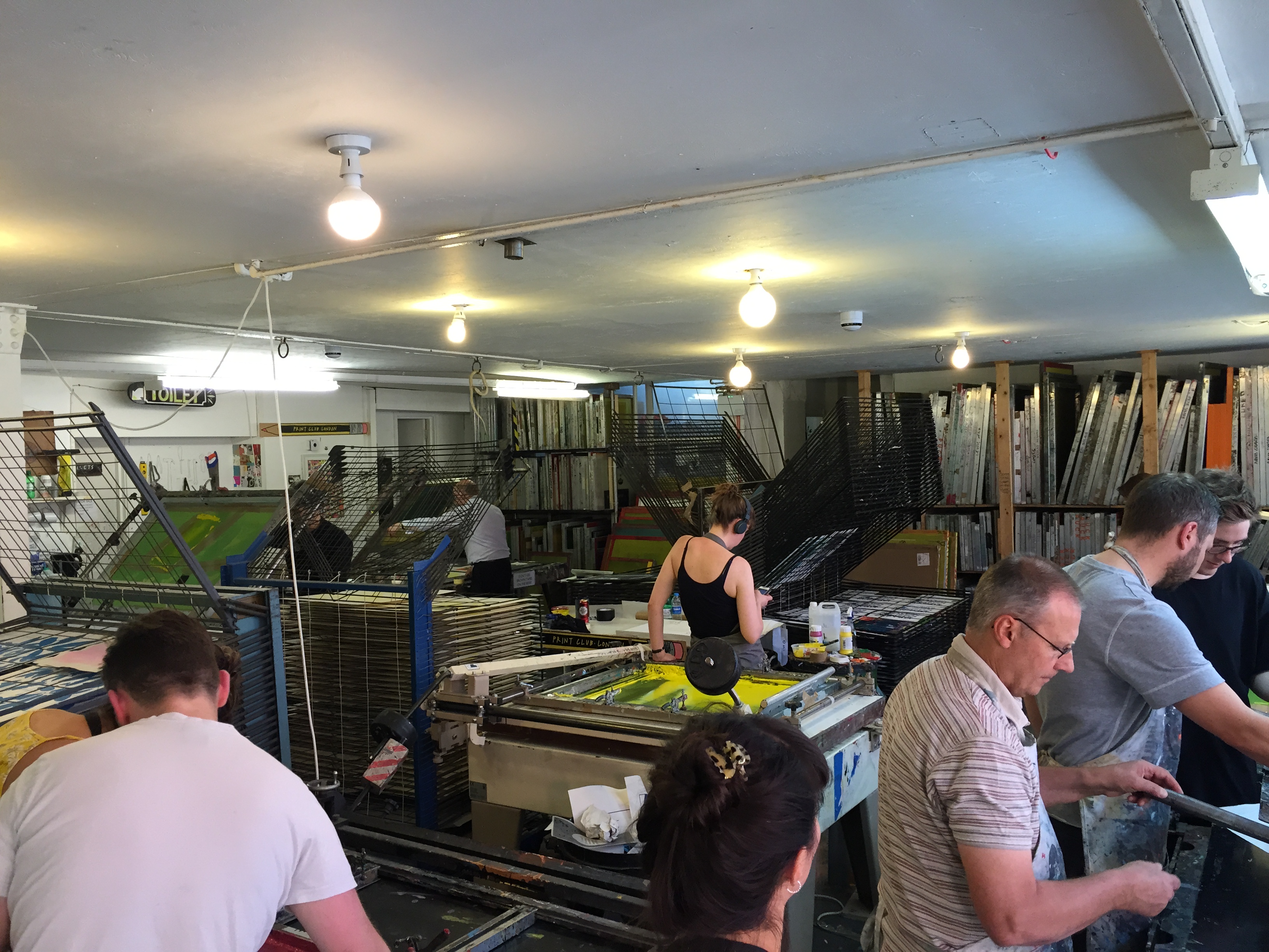
One of the gifts Wist bought me for my birthday this year was a workshop at Print Club London.

IMG_3129

It’s situated near the Rio in Dalston, on a beautiful side road next to MC Motors.

IMG_3103

The Print Club is a great shared workspace for artists and designers – sign up and you get access to all of their screenprinting equipment.

IMG_3120

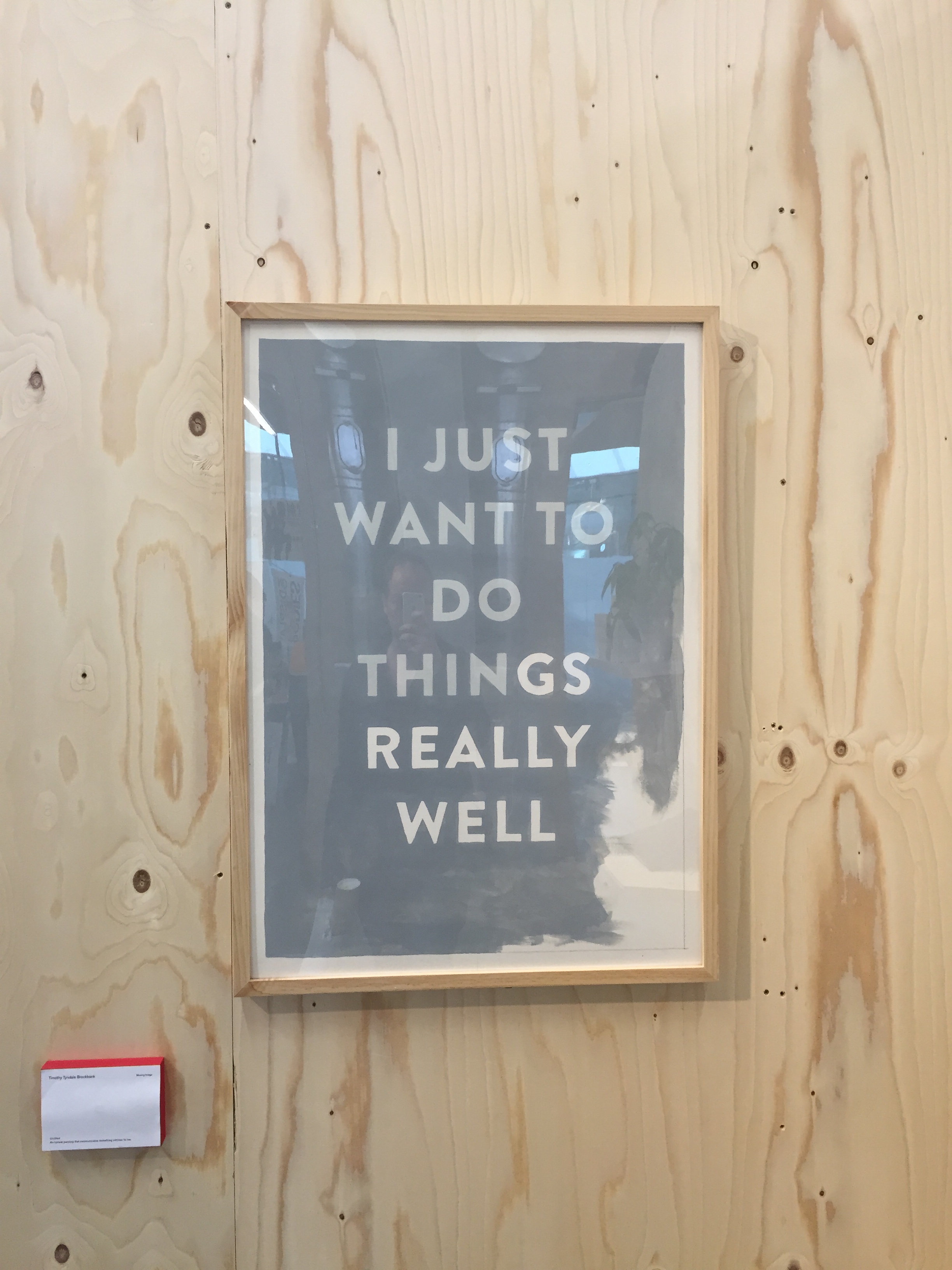
As I’d been in Cannes the week before, I hadn’t really prepped properly for creating something, so I fumbled together a text print based on Debussy’s quote ‘Music is the space between the notes’ the night before the workshop. Andy Bird would not be impressed with the kerning… Here’s the finished thing.

IMG_3506

The course tutors are excellent – Barry led the day with Elliot and Jim assisting. If you’ve always wanted to try screenprinting, it’s well worth it. Just go – you’ll love it.

Below are the notes I took during the workshop, tidied up a little for memory’s sake.

SCREENPRINTING NOTES 27.06.15

#1. Prepping your image

To create a crisp image when using photo-sensitive emulsion to screenprint, we need to create a ‘positive’, an image made up of only pure black or pure white. Most images have shades of grey (even some that appear to be black and white.) So we have to convert them. To do that, we first need to greyscale the image in photoshop (image > mode > greyscale) and then bitmap it (image > mode > bitmap).

For blockier images (e.g cartoons or text) we can bitmap using ‘50% threshold’. This pushes anything below the halfway point of the light spectrum to pure black, and anything above the halfway point on the light spectrum to pure white.

For photorealistic images, we need to use halftone printing. Halftone printing allows us to show shades, by using different sized dots. Once you’ve clicked on bitmap you need to use the halftone option, taking care to match your input with your output resolution. Then just choose your shape and play around. Round is the most common shape (used in pop art and comic books.) But there are many others, and you can even choose your own custom shape.

If you choose a higher frequency, you’ll get more detail in the print. A lower frequency, you’ll get fewer (but bigger) shapes in the print. As we were working with a 90 threadcount screenprint, Elliot told us we shouldn’t go any higher in frequency than 40, as the detail won’t get picked up by the screen. The halftone angle should be a number that doesn’t end in 0 or 5 (or it will play tricks on your eyes with the Moire Effect.)

As your positive can only be made from 100% black or 100% white, if you want to print multiple colours, you need to create multiple positives, that each go onto a separate screen. So if you were printing a Captain America comic, you’d need to create a red layer, a blue layer and a black layer. Each layer takes about 4-5 hours, so you can end up with a ton of work if you choose more than 4 layers.

The hardest bit when printing more than one colour is registration – getting each layer to line up perfectly with each other. Because you can press slightly harder on the left than the right, or the screen falls in slightly different place etc.

#2. Prepping your screen

Photo-sensitive emulsion is used on the screen to create custom stencils that ink is pushed through. It hardens when exposed to light, so should only ever be applied in a dark room.

The coverage of the emulsion on the screen needs to be consistent, without any patches. If there’s a bit too much emulsion on there, it doesn’t matter too much (although it will take forever to dry…) It’s an issue if there’s no emulsion on there.

To cover your screen, you need to fill the scraper with emulsion. Place the scraper’s edge against the bottom of your screen and slowly tilt until the emulsion makes contact along the length of the screen. Use the sharp side of the scraper if you’re printing on paper, the rounder end if you’re printing on fabric. Then in one move, pull the scraper up to the top.

Tilt the scraper back to horizontal, and wiggle it to remove any excess on the canvas. A little piece of cardboard should be used along the edges to remove any excess emulsion.

The screen should then be placed in the dark dryer rack, until the emulsion is dry.

#3. Printing your image

Using the photosensitive properties of the emulsion allows us to use light to transfer our positive onto the screen. To do this, our positive needs to act as a stencil (for light). Ordinary B&W printing works for this, onto either tracing paper or acetate. Both have their benefits: Tracing paper is much cheaper can rip easily and falls apart. Acetate is much stronger and is wipe clean, but it’s about 10 times more expensive. You can print your stencils at home on laserjet printers. Inkjet printers don’t work as they give incorrect coverage on the sheet. Or you can simply draw onto tracing paper or acetate with a black marker or a chinograph pencil.

#4. Checking your image

When our image is printed onto acetate or tracing paper, you’ll often get inconsistent printing. Any black dots that have come out that shouldn’t be there, you can cut them out with a scalpel. Any bits that should have printed out but haven’t (e.g speckles on heavy blacks) then you can colour them in with a hard black marker.

#5. Exposing your screen

Once your screen has dried, the next job is to print your image onto it using the Exposure Unit. It’s basically a sunbed, with a rubber canvas on the top (to save your eyes…)

After making sure the exposure glass is clean (glasscleaner and sponge on the side if you need it…), you should lay down your acetate artwork face up (so if it’s text, you should be able to read it.)

The screen should then be placed on top of the artwork (canvas face down first rather than frame first.) It doesn’t need to be exactly straight, as you’ll need to register it when printing anyway.

A little bit of rubber wire is placed on top of the frame edge, to allow air into the frame, ensuring vacuum pressure on the canvas.

42 units of light is good for the emulsion used at Print Club. Too much light, everything will harden on your screen and you won’t be able to print. Too little light, all of the emulsion will wash out and you’ll be back to where you started. The vacuum goes for 25 seconds before the light engages.

#6. Washing out your screen

Once that’s done, you need to wash your screen out. This washes away all the unhardened emulsion, leaving you with a stencil on your screen for pushing ink through. You do this by soaking the screen with a hose, then spraying it with the pressure washer. To avoid ripping your canvas, make sure you spray off of your screen first and then move onto it.

Then leave it out to dry and go to lunch…

IMG_3108

#7. Fixing up your screen

Pinholes are little holes that appear in your screen, where emulsion has flicked away where it shouldn’t. To fix this, tape up the holes on the canvas side of your screen. It’s also a good idea to tape up the outside edges of your canvas (on the canvas side of your screen) as ink can sometimes get through here.

#8. Registering your screen

To register your print, you need to stick it onto a piece of paper (if you’re printing A4, A4…) in the position you want it to sit. Attach long cardboard arms to the paper and place under the screen. Then use the arms to move the paper around until it lines up with when your screen is. To make sure it’s exactly right, press down on your screen, as this can sometimes effect the accuracy of your registration. Once the paper is in the right place, put registration markers on the base and side of your paper. This will allow you to slot another piece of paper in easily, without having to measure it all again.

#9. Flooding your screen

Lift the screen up and flood it with ink. This involves putting your coloured ink at the base of the frame side of your screen and pushing it down the screen with the squeedgee edge closest to you.

Screen Shot 2015-06-29 at 16.17.00

You can beautiful print gradient blends by placing different colour inks along the base, and flooding the screen several times to blend the ink.

#10. Screenprinting

Lift the screen and put your paper underneath on the registration markers. (Never move onto your good paper before you’ve tested it out on 5 or so scrap pieces.)

Lower your screen and drag your squeedgee towards you, back down the screen at a 45% angle, applying significant pressure.

Screen Shot 2015-06-29 at 16.18.54

Lift the screen slightly, and flood the screen again so it doesn’t dry out. Then remove your new screenprint and put it on a rack to dry.

Load with paper and go again.

Once dry you’ve got a screenprint!

#11. Stripping your screen

To strip your screens once you’ve finished, take all the tape off the screen and spray it down (on both sides) with the methlated spirit gun. Then scrub it with a brush until you can see the emulsion breaking down (it will go quite soapy.) From there, spray it down with the pressure hose – and your screen is good as new and ready for the next project…

So I’ve finished the 25 series. Whiskies was a winner, as was comedy gigs. I didn’t really commit properly to 25 breakfasts from around the world – other than the few Wist sorted out for me (Akuri at Dishoom, Pancakes bacon and grits at Jackson & Rye both top of the list) – so I’m going to scratch that challenge from history.

Here’s the finished lists.

25 Comedy Gigs:

  1. Stewart Lee @ The Soho Theatre, Work-in-progress show
  2. Steve Richards @ The Park Theatre, Rock & Roll Politics
  3. Adam Buxton @ Kings Place, Work-in-progress show
  4. Tim Key @ Union Chapel, Invisible Dot
  5. Josie Long @ Union Chapel, Invisible Dot
  6. Joshua Ross @ Leicester Square Theatre, New Comedian of the Year
  7. Mark Thomas @ Tricycle Theatre, Cuckooed
  8. Comedy Store Players @ Comedy Store
  9. Tim Key @ Invisible Dot KX, Father Slutmus
  10. Stewart Lee @ The Bloomsbury Theatre, Robin Ince’ Christmas Ghosts
  11. Josie Long @ The Bloomsbury Theatre, Robin Ince’ Christmas Ghosts
  12. Festival of the Spoken Nerd @ The Bloomsbury Theatre, Full Frontal Nerdity
  13. Alan Davies @ Comedy Store, Stand up for Stand up
  14. Sean Lock @ Comedy Store, Stand up for Stand up
  15. Joe Wilkinson @ Bloomsbury Theatre, Joe Wilkinson & Friends
  16. Rhys James @ The Pleasance, Work-in-progress show
  17. Lloyd Griffith @ The Pleasance, Work-in-progress show
  18. Stewart Lee @ Cheltenham Town Hall, Room with a Stew
  19. Mark Thomas @ Finchley Arts Centre, Cuckooed
  20. Ellie Taylor @ The Good Ship
  21. Andrew Maxwell @ The Good Ship
  22. Ninia Benjamin @ The Bedford, Banana Cabaret
  23. John Moloney @ The Bedford, Banana Cabaret
  24. Tom Wrigglesworth @ Udderbelly, Best of the Comedy Store
  25. Sean Collins @ Udderbelly, Best of the Comedy Store

25 Whiskies:

  1. Yamazaki 12yo, Japan, Barbecoa
  2. Nikka From The Barrel, Japan, L’Enclume
  3. Glengoyne 12yo, Scotland, L’Enclume
  4. Gentleman Jack, USA, BA Lounge T5
  5. Compass Box Hedonism, Scotland, Flat N1
  6. FEW Rye Whiskey, USA, Flat N1
  7. Caskstrength & Carry On Cutty Sark, Scotland, Flat N1
  8. Nikka Yoichi 20yo, Japan, Flat N1
  9. Goldlys 12yo Manzanilla Finish (1st release), Belgium, Flat N1
  10. Glengoyne, 10yo, Scotland, John Gordons
  11. K5 Himalayan, Bhutan, Virgin Clubhouse T3
  12. BenRiach 13yo 1999 Virgin American Oak Finish, Scotland, Flat N1
  13. Rebel Yell Kentucky Bourbon, USA, Flat N1
  14. Tincup American Whiskey, USA, Flat N1
  15. Caol Ila, Scotland, Hotel Du Vin Cambridge
  16. The Peatmonster, Scotland, Hotel Du Vin Cambridge
  17. Reference Series I, Scotland, Skiber An Hyli
  18. Dalwhinnie 1996 Oloroso finish Distillers Edition, Scotland, Skiber An Hyli
  19. Togouchi 12 Year Old, Japan, Flat N1
  20. Glenburgie – Batch 1 That Boutique-y Whisky Company, Scotland, Flat N1
  21. Breckenridge Bourbon, USA, Flat N1
  22. High West Campfire Whiskey, USA, Flat N1
  23. Old Pulteney 17 Year Old, Scotland, Flat N1
  24. Strathmill 12 Year Old Flora and Fauna, Scotland, Flat N1
  25. Lagavulin 16 Year Old, Scotland, Goodmans Mayfair

I managed to avoid Irish whiskey entirely – not by choice, but just through distribution. I’d wanted to try Penderyn whisky too – but didn’t get a chance over the year. So will have to pick it up at some point in the future.

Screen Shot 2015-06-20 at 17.50.51

Like last year, I’ve decided to put together 25 photos that sum up my year.

They’re at this link here

25 Photos.001

Challenge 26 coming up soon.

Haven’t had much time to write here recently – but here’s an update on how I’m doing with the Stand Up Comedy challenge.

I forgot to take a photo for number 12 – Festival of the Spoken Nerd at The Bloomsbury Theatre, Full Frontal Nerdity.

So photos start with 13. Alan Davies and 14. Sean Lock at the Comedy Store, for Stand up for Stand Up

IMG_7938

15. was Joe Wilkinson at The Bloomsbury Theatre.

IMG_7952

16. and 17. was Rhys James and Lloyd Griffith at The Pleasance Theatre.

IMG_7957

18. Stewart Lee (again.. oops!) at Cheltenham Town Hall.

IMG_9505

I also duplicated Mark Thomas – his show was so good I had to see it twice.

IMG_9535

The Good Ship was a great week-day comedy show we found – they have some brilliant acts on testing their material. I saw Andrew Maxwell and Ellie Taylor.

IMG_9549

And to bring the blog completely up to date – I saw Ninia Benjamin and John Moloney at The Banana Cabaret night at The Bedford.

IMG_9822